In my previous post, I explained how one of the most widely used customer segmentation models – the RFM analysis – can be performed. Today I want to continue with customer analysis topic and guide you through the process of applying machine learning to customer segmentation.
K-means algorithm
K-means is an unsupervised machine learning algorithm, which is used for data clustering. The k-means algorithm defines k number of cluster centroids and then assigns each data point to the nearest cluster while trying to keep the clusters small.
Assumptions and data preprocessing needed for k-means clustering
To obtain reliable results, data needs to satisfy a few assumptions. It cannot contain outliers which influence the k-means algorithm. Moreover, data should be unskewed and have the same mean and variance for every feature.
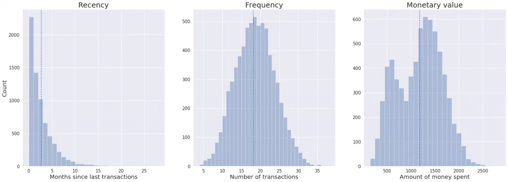
Let’s take a look at our data and check if it satisfies k-means clustering requirements.
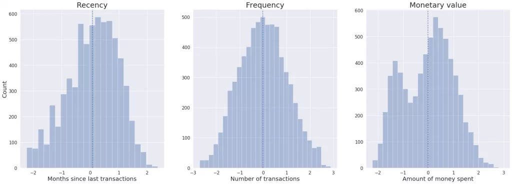
We can observe that recency distribution is skewed. Moreover, features have different means and variances. So first, we need to unskew data by implementing the log transformation on the recency column. Then, we standardize data, so all features have mean equals zero and the standard deviation equals one.
As you can see on the plots below, after transformations all the features are unskewed and have the same mean and variance.
Now, we will identify the outliers using a box plot and the interquartile range score. The box plot gives us information about data distribution and presence of outliers based on five-number summary:
- “minimum” – the lowest data value excluding outliers (shown as the end of the left whisker)
- the first quartile (Q1) – 25th percentile (shown as the left side of the box)
- median (shown as the line inside the box)
- the third quartile (Q3) – 75th percentile (shown as the right side of the box)
- “maximum” – the highest data value excluding outliers (shown as the end of the right whisker)
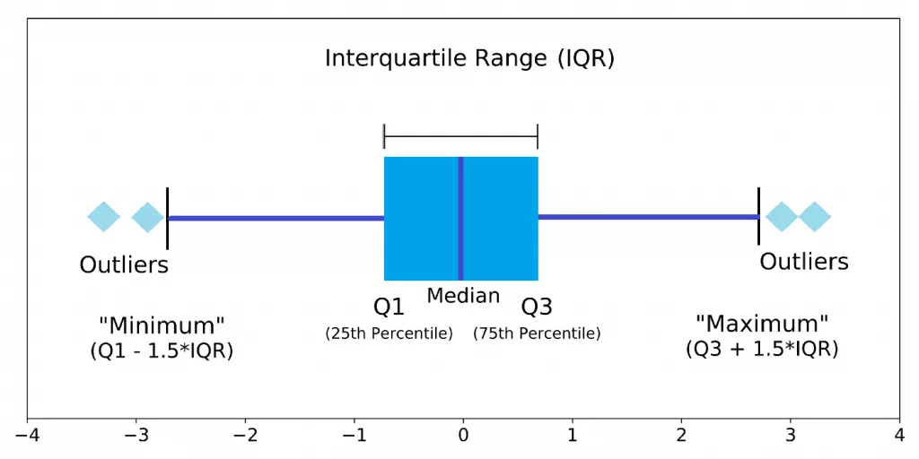
“Minimum” and “maximum” values are defined in the following way. First, the interquartile range is calculated:
IQR = Q3 – Q1
Next, “minimum” and “maximum” are computed using the below equations:
“minimum” = Q1 – 1.5IQR
“maximum = Q3 + 1.5IQR
Any data point below “minimum” or above “maximum” is considered to be an outlier.
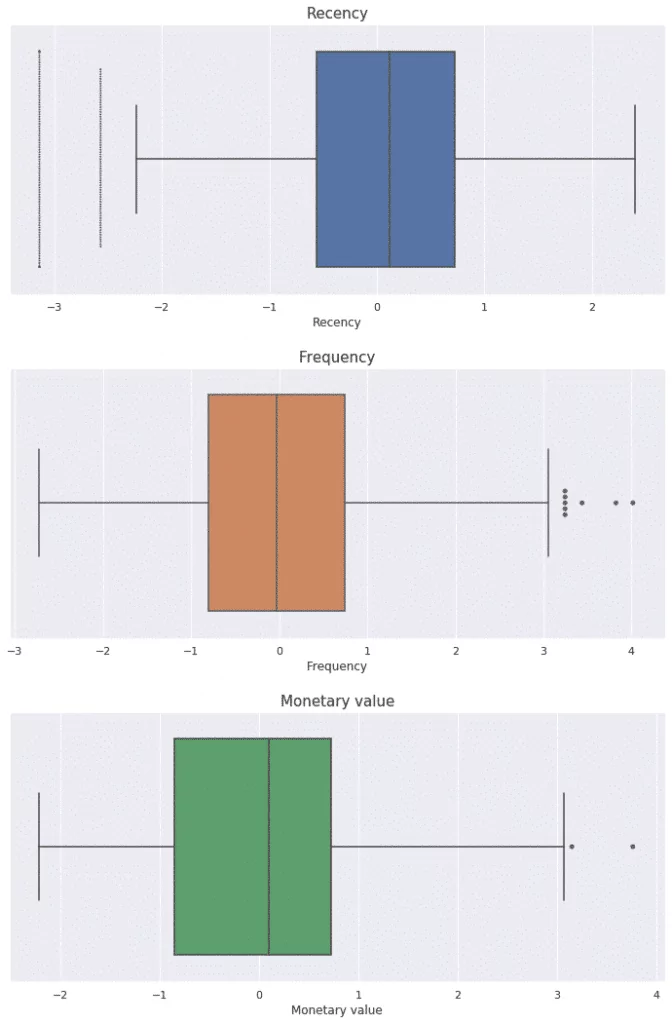
Looking at the box plots for our data, we can observe that each feature contains some outliers, which should be removed. After this operation, our data fulfils all requirements and we can move to k-means clustering.
Applying k-means clustering
We start by finding the optimal number of clusters for the k-means algorithm. We will use the elbow method.
First, we need to perform k-means clustering for a range of values for k. Then for each value of k, the average score for all clusters is calculated. As the scoring metric, we used inertia, which is the sum of the distances from each data point to its assigned cluster centroid. Next, we plot inertia versus k and looked for the ‘elbow’ point (the point at which decrease starts to slow down).
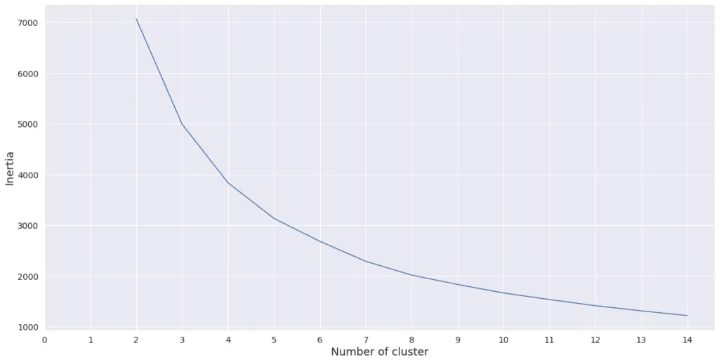
It looks like decrease starts to slow down between 3 and 5. I decided to use 5 clusters to perform k-means clustering. Let’s now create clusters and see their characteristics.
The best customers are in cluster 2 and 4. They spent the greatest amount of money and made purchases most often. Promising clients are in cluster 1. They spent quite a lot of money recently, but they didn’t make many transactions, so they are probably new customers. Customers in cluster 0 made the last purchase a long time ago, but they spent a lot of money, so it is worth to encourage them to go back by providing them with some special offers. The worst customers are in cluster 3 – they made last purchase a long time ago and spent little money.
| Cluster | Mean recency | Mean frequency | Mean monetary value | Number of users |
| 0 | 3.56 | 18.49 | 1258 | 1997 |
| 1 | 0.74 | 14.11 | 771 | 1011 |
| 2 | 2.03 | 25.41 | 1797 | 1180 |
| 3 | 5.33 | 11.92 | 592 | 1378 |
| 4 | 0.51 | 20.80 | 1446 | 1138 |
Closing notes
We can see that using k-means clustering we divided customers into clusters. Customers in each cluster have similar buying behaviours, so we can use them to personalize marketing offers similar to the results from classical RFM analysis.
The choice between traditional RFM analysis and k-means clustering is up to you. On one hand, k-means clustering provides more comprehensive and diverse segments, on the other – the segments could be harder to interpret.


